These are the release notes for September 2024 from Kubo by NDD.
See a summary of all the updates and click on the links to navigate to each one.
NEW FEATURES
-
Functionality for replying to comments made on trainings (administrator's view and student's view) →
IMPROVEMENTS
NEW FEATURES
IMPROVEMENTS
NEW FEATURES
IMPROVEMENTS
-
Revision of the layout of the administrator's initial “Dashboard” screen (administrator's view) →
-
Revision of the layout of the “My data” screen (student's view) →
-
Revision of the layout of the “Notices” screen (student's view) →
NEW FEATURES
-
Sharing the final result of a gamification campaign on LinkedIn (student's view) →
-
New gamification campaign tiebreaker rules tab (student's view) →
September 30, 2024
New features
Functionality for replying to comments made on trainings
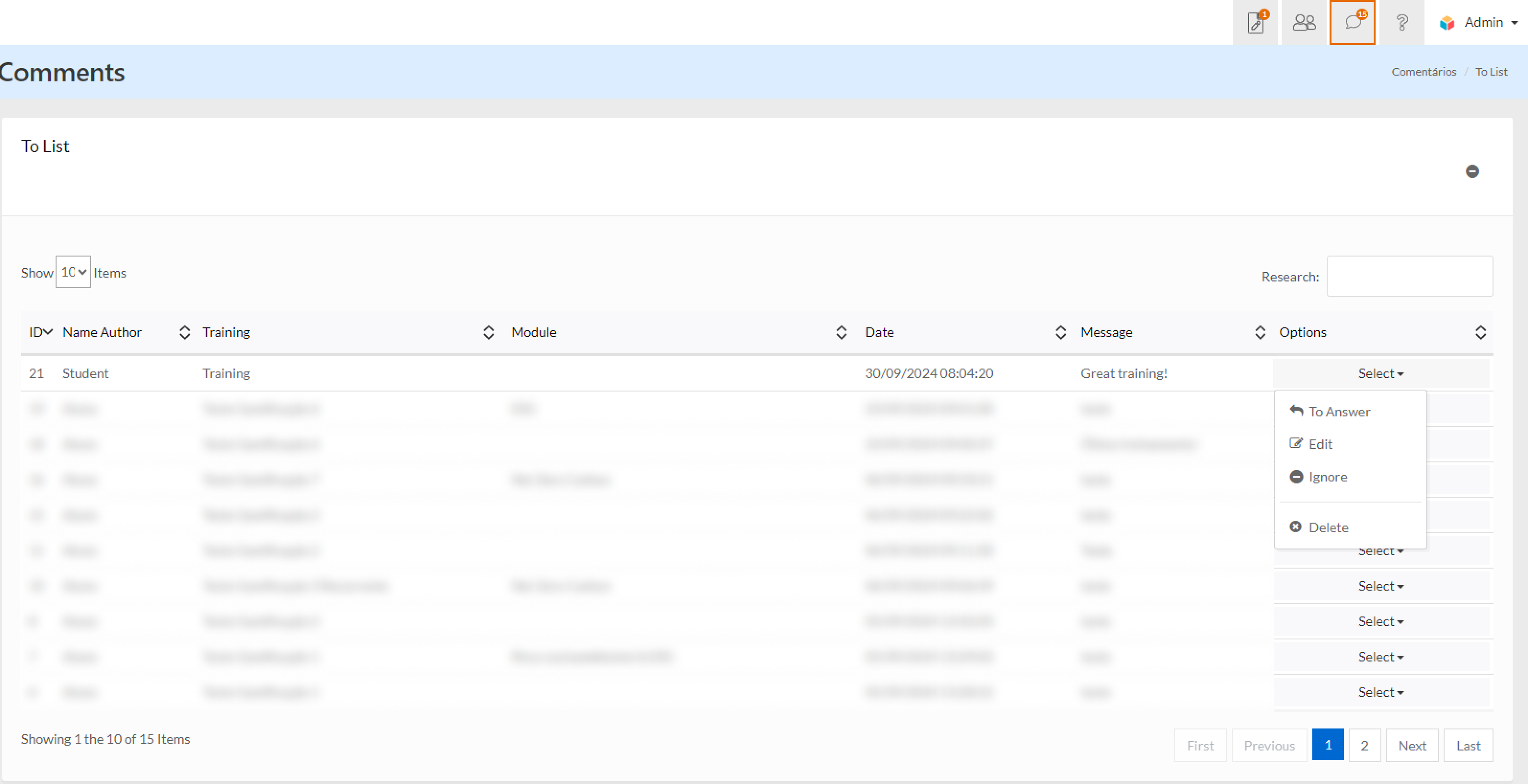
Now, the administrator can view all comments on all trainings and access the list by clicking on the top icon (shaped like a speech bubble). Within the list, the administrator can reply to, ignore, edit or delete comments, moderating them accordingly.
Whenever new comments are made, the meter next to the icon will show the updated number of unviewed or evaluated comments.
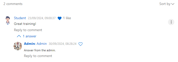
When the administrator replies to a comment, their reply will be highlighted to students, setting it apart from other comments. Every student who enrolls in that training will see the history of comments made previously, including the administrator's replies, which helps to reduce the number of trainings students have to attend in case of doubts, as they will be able to read the doubts of others.
Improvements
New to the trainings comments feature
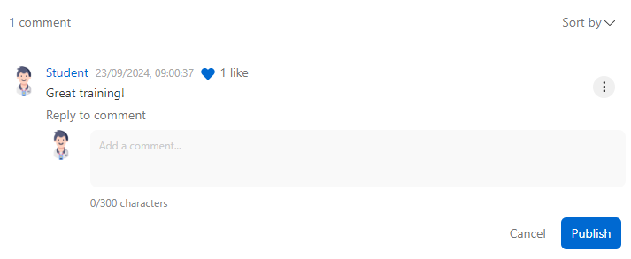
Students can now reply to other students' comments and react to them by liking them to show support or agreement. In addition, each comment and reply will display a meter of likes, highlighting the interactivity on the platform.
The learning manager is still responsible for answering any questions that are posted as comments so that not only the student who asked the question, but also the others, can see the answer publicly, acting as a moderator.
Improved login via integration with Microsoft Azure
The system will now ask for confirmation of the account used when logging into the learning environment, allowing the student to view the e-mail address used. Previously, when the browser saved the credentials, the login was done automatically, without showing which account the student was accessing with.
For example, if the student has more than one Microsoft account, they can choose the correct account linked to the platform login. Therefore, this functionality applies to customers who use the “single sign on” model.
September 16, 2024
New features
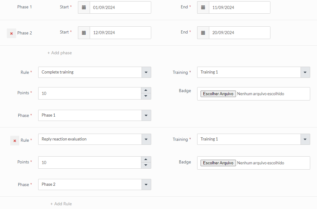
Creation of phases in gamification campaigns
It is now possible to create multiple phases within the same gamification campaign, with defined start and end times. This way, as time progresses, students unlock and view the rules for subsequent phases.
This functionality makes it possible to structure long-term campaigns, divided into phases, with a focus on instigating participating players and increasing engagement throughout the campaign.
The campaign must contain at least 1 mandatory phase.
Each rule should be linked to the respective phase, so we recommend planning and distributing the learning items by phase first, assessing the degree of difficulty of each one.
Each phase has a start and end date.
Good practice:
-
Recommendation 1: properly balance the number of learning items per phase, also considering their complexity.
-
Recommendation 2: the tie-breaking criteria should also be thought of in the context of phases, since a certain criterion can seal the player with the best chance of winning the campaign from the outset.
Podcast session and Spotify integration
Now, by linking to a Spotify podcast, the content will be automatically embedded as an “iframe”, allowing the student to play the episode and view the duration directly on the platform, without the need to access an external link or open Spotify.
In this way, the learning manager can include external podcasts from Spotify without having to store the audio, taking advantage of good quality content that is available on the platform.
The system only accepts podcasts without video from Spotify.

Improvements
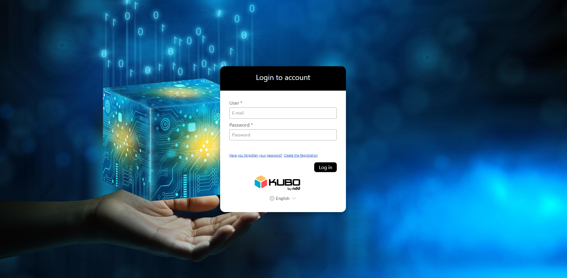
Revision of layout - student and administrator login screens
The student and administrator login screens have been revised with the aim of modernizing the design in line with the style already applied to the platform, ensuring a coherent interface.
Standardization of access names in the student register
The nomenclatures relating to student access have been standardized in the administrative environment, on the list, registration and modification screens, ensuring the same language throughout the platform.
The classification differentiates between:
-
Enabled: student with current access.
-
Disabled: student with blocked access.
Students with disabled access can be reactivated and use the platform again.

September 09, 2024
New features
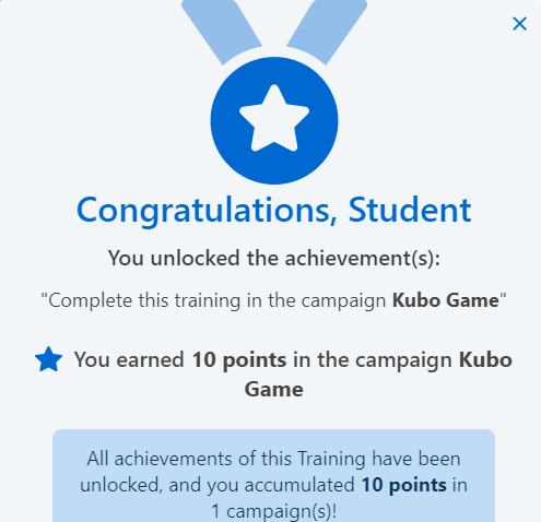
Pop-up notification window when complying with a campaign rule on the training screen
When a student completes a rule in a campaign they are taking part in, the system will display a pop-up on the training screen.
This notification window will tell you which rule has been completed, how many points have been earned and which campaign the rule is associated with.
New comments tab on the internal training screen
We have implemented a new comments tab on the internal training screen. If the training is configured to allow comments, the tab will be displayed at the bottom of the screen, as shown below:
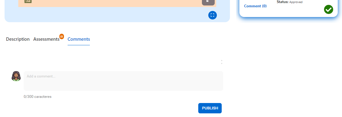
In this tab, students will be able to create comments on the content, promoting interaction between students and the platform manager.
The tab follows the platform's standard layout and is easy to access and use.
Improvements
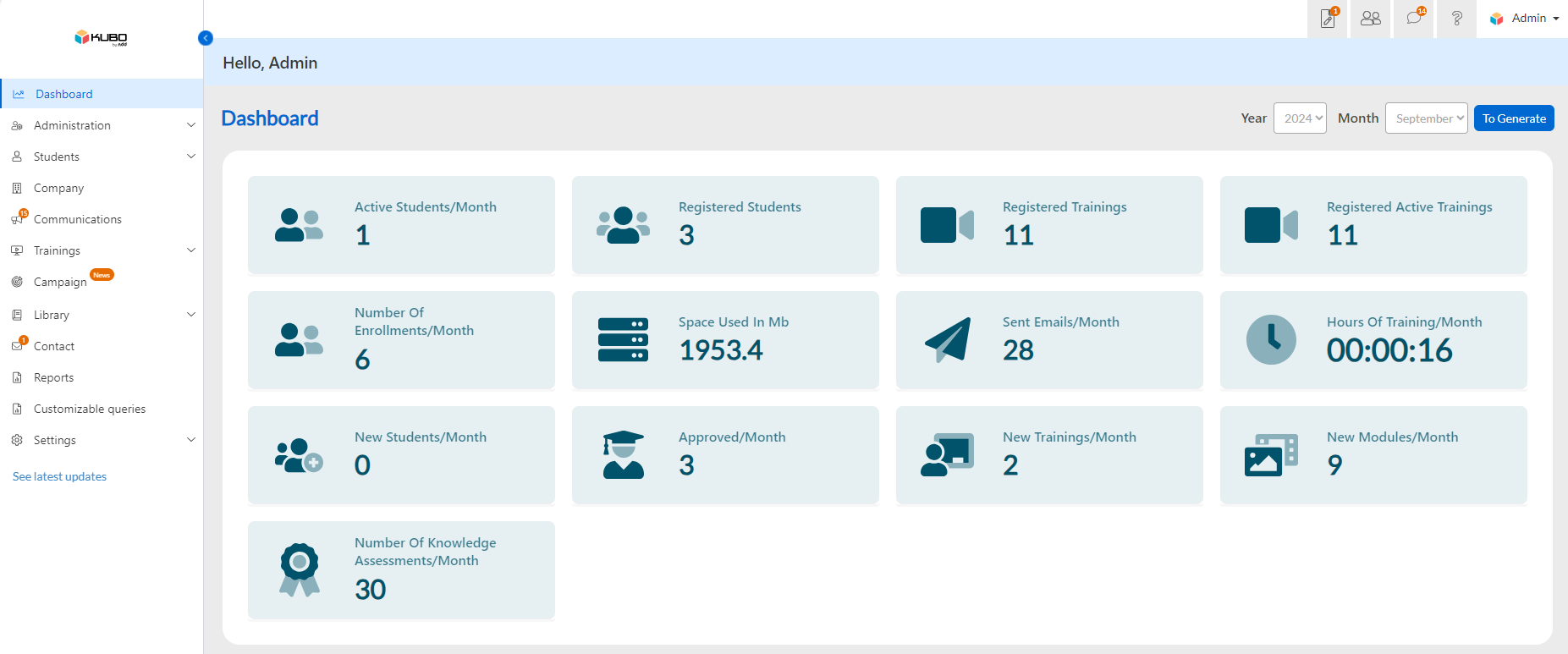
Revision of the layout of the administrator's initial “Dashboard” screen
We redesigned the administrator's home screen, the Dashboard menu, to improve the organization of the elements and harmonize the look in line with the platform's current standard, making it more neutral in terms of color application.
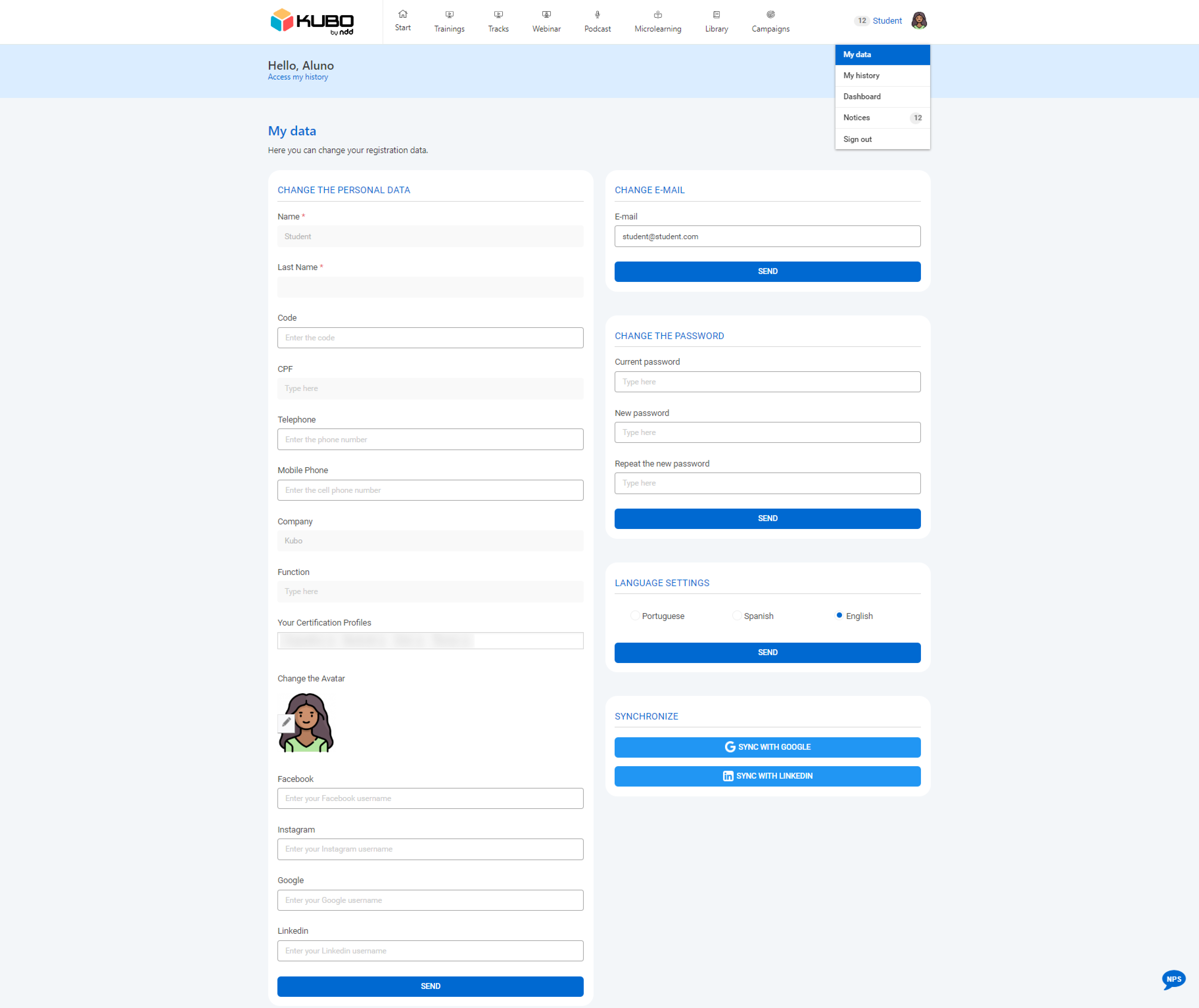
Revision of the layout of the “My data” screen
The My data screen has undergone a layout review with the aim of improving the organization of the fields and aligning the look with the standard adopted in the current version of the platform, providing a cleaner and more intuitive interface.
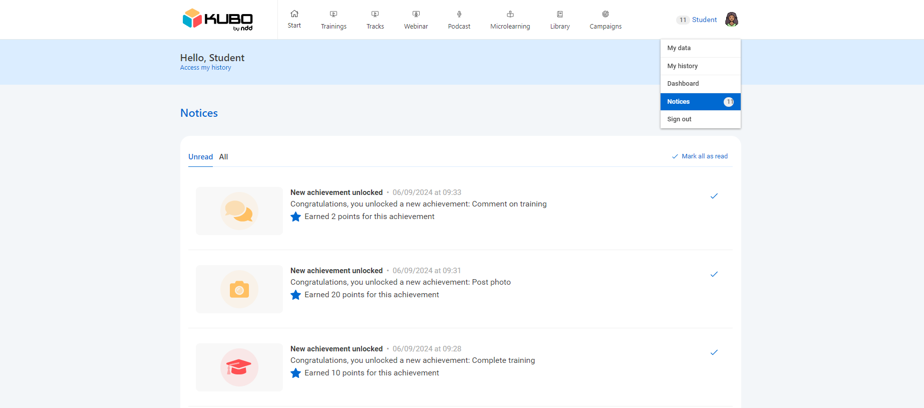
Revision of the layout of the “Notices” screen
The Notices screen has undergone a layout overhaul, including the addition of information and functions.
Two top tabs have been implemented, Unread and All, where general notices and achievements from gamification campaigns will be listed.
Students can mark each notice as read individually (✔) or, more conveniently, mark them all as read by clicking on the top button Mark all as read.
September 02, 2024
New features
Sharing the final result of a gamification campaign on LinkedIn
Students involved in gamification campaigns will be able to share their achievements directly on LinkedIn.
In the Campaigns tab of the history, the To Share button has been added, which allows creating a post about the finished campaign.
This feature is only available for campaigns with the status Finished.
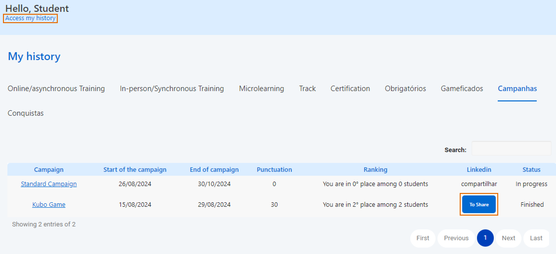
If the student has not yet synchronized their LinkedIn account, the To connect button will be displayed instead of To Share. By clicking To connect, a new tab will open for the student to enter their LinkedIn credentials. After synchronization, the To Share button will be enabled.
On clicking To Share, a pop-up will appear with a default text, which can be changed by the student. The administrator can modify the default text to be shown to students by contacting support.
Default text:
It’s time to celebrate! I completed all the challenges of the [campaign_name] Campaign organized by [company_name]. Each achievement represents a lesson learned, and I am very happy to share that I ranked [position_in_ranking] out of [total_of_competitors] competitors. #gamification #corporateeducation #innovation #engagement #recognition #kubolxp 👑👑👑🏆🏆🏆
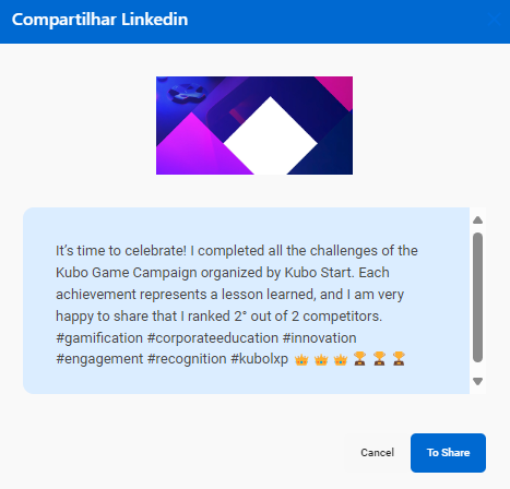
After clicking To Share on the pop-up, the post will be published automatically on LinkedIn, containing the campaign's cover image and the default text or one changed by the student.
To increase the visibility of the achievement, we recommend that the student tags the company in the post, highlighting their engagement and participation.
New gamification campaign tiebreaker rules tab
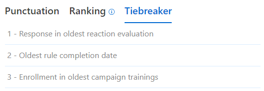
Students can view the campaign's tiebreaker rules by clicking on the Tiebreaker tab in the campaign details.
This tab will list the three tiebreaker rules in order of priority, as configured by the administrator.
